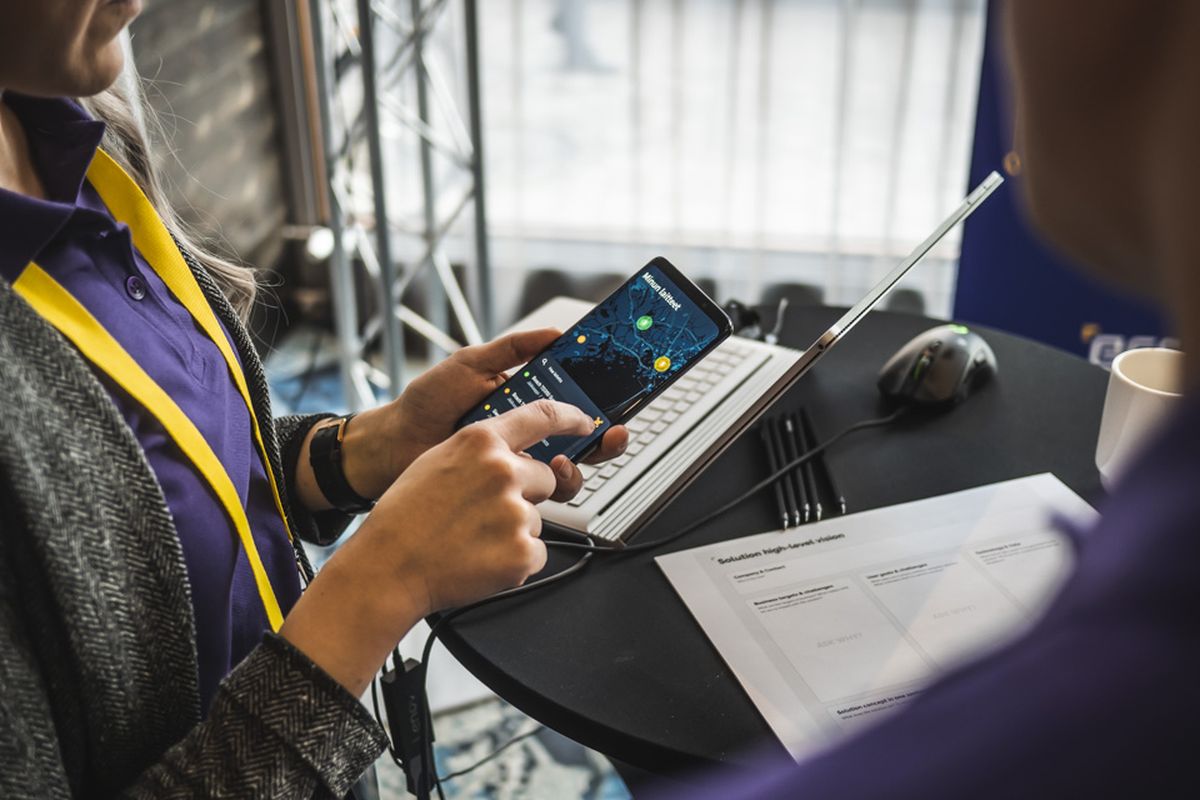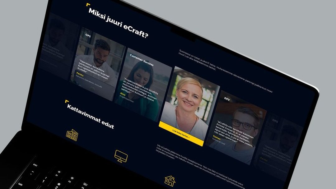
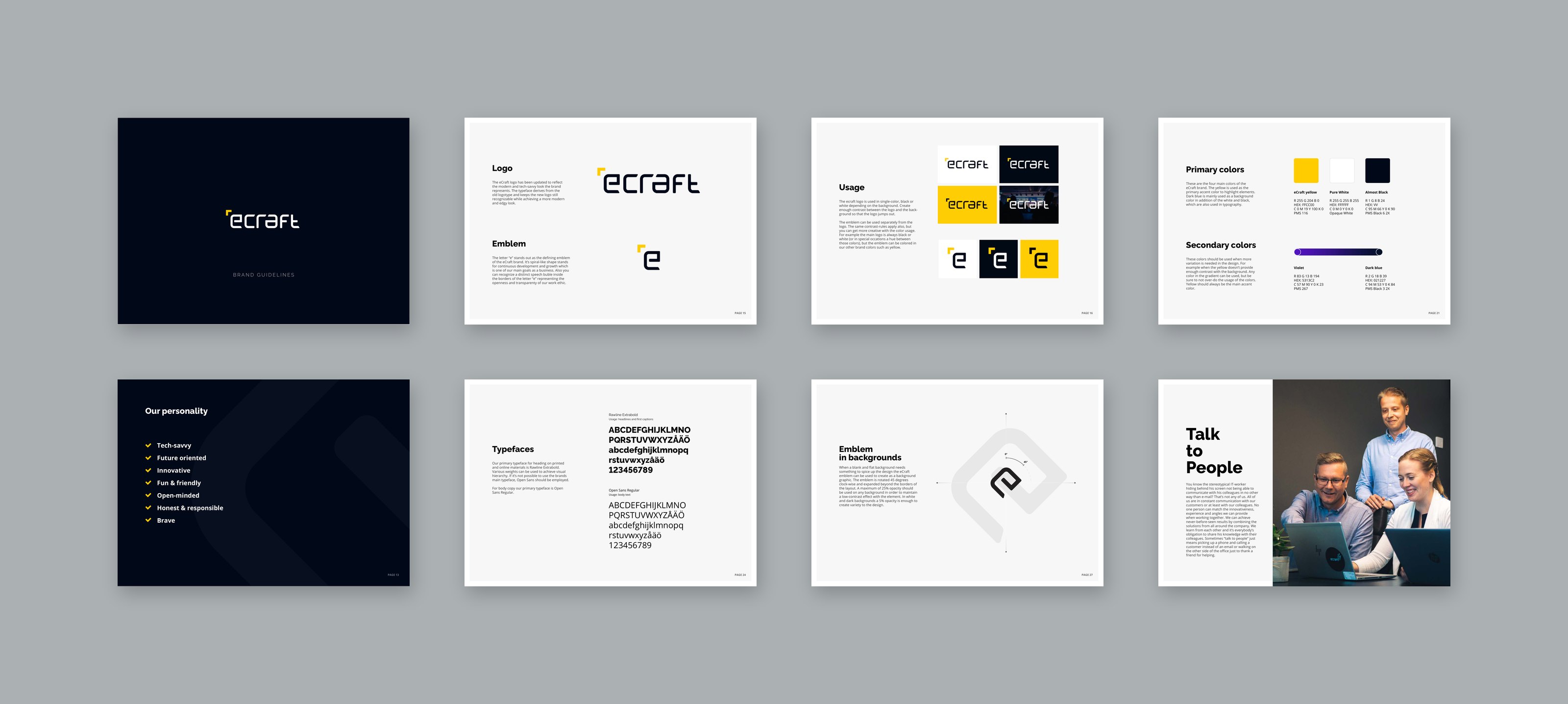
I joined eCraft as a graphic designer and grew into the Art Director role there. I refreshed the logo, colors and visual assets, built the brand guidelines, and redesigned the website.
eCraft's look was old and undifferentiated. The goal was a modern, professional identity that could compete with bigger Finnish IT houses, while stepping firmly away from the "boring IT company" look most competitors shared.
We landed on something cool and sleek: a dark theme with yellow highlights, professional enough to win serious clients but with a twist competitors didn't have. Employee count doubled in the years after the rebrand, with the brand itself helping attract new talent.
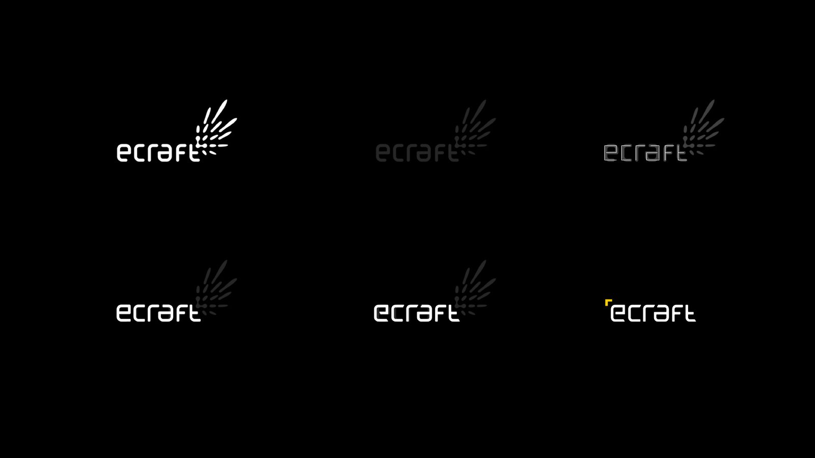
The logo update: the shapes of the new wordmark were already there in the old one, so the refresh respected eCraft’s history instead of breaking from it.
Professionalism, with a cool twist.
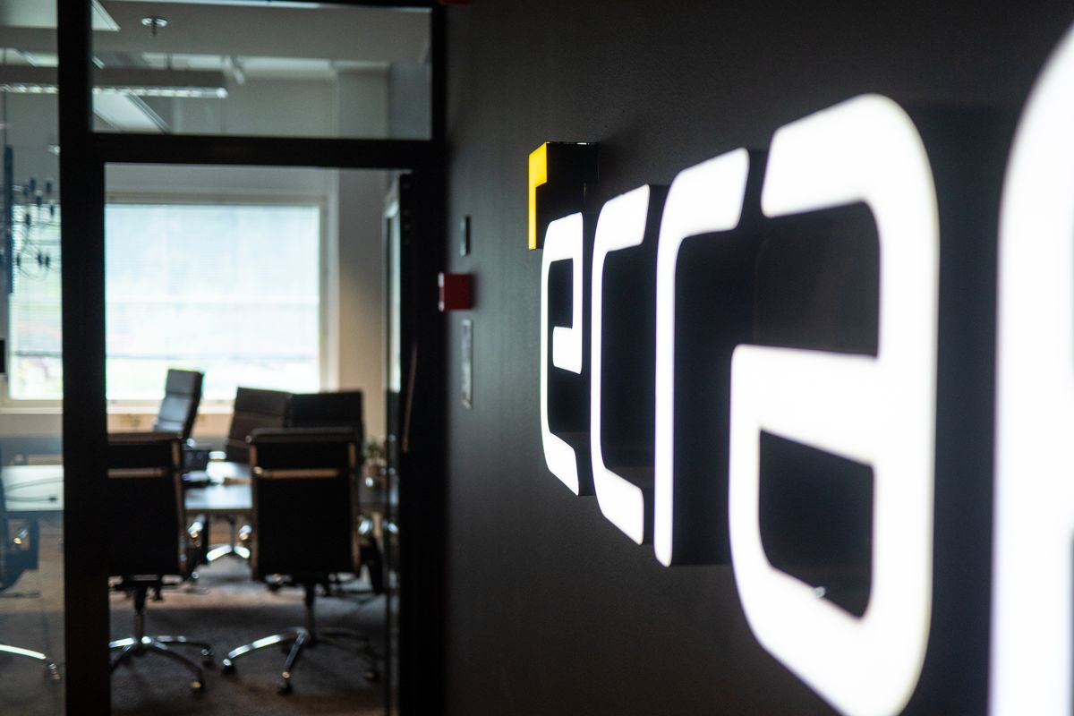
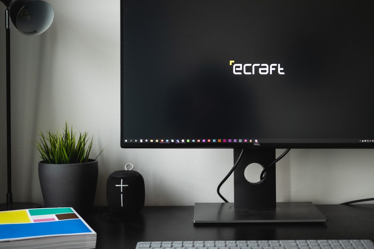
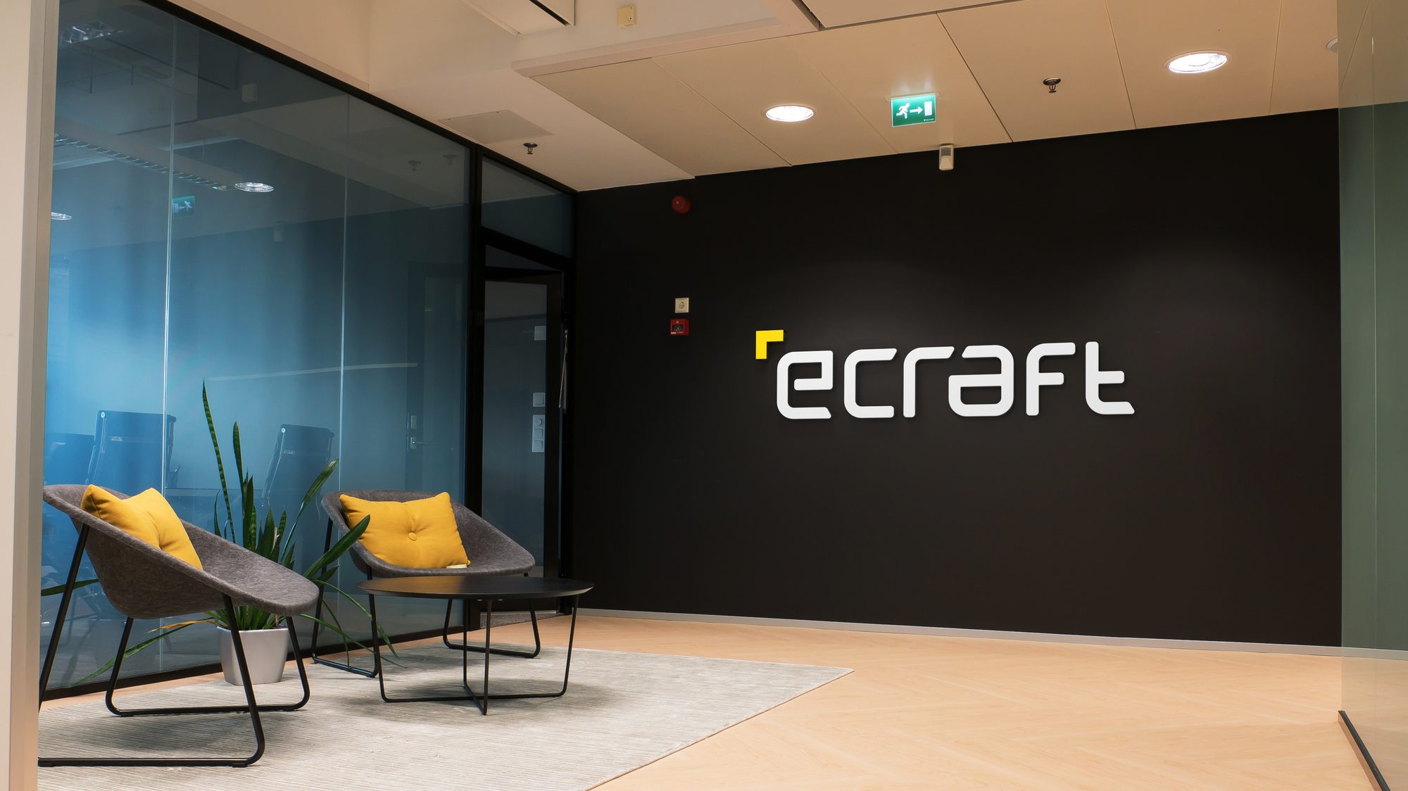
The backlit wordmark greets you at the office entrance, and the same mark quietly holds down a desk as a lock screen. A dark theme with yellow highlights gave eCraft a cool, sleek edge, stepping away from the visual clichés most IT competitors leaned on.
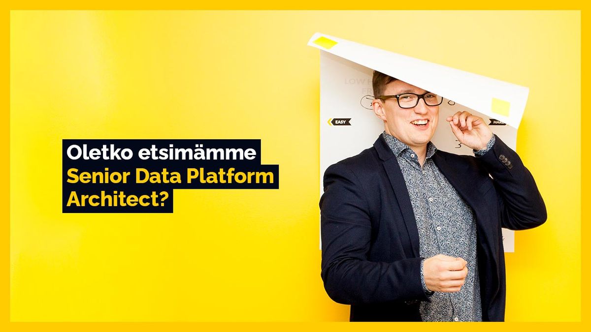
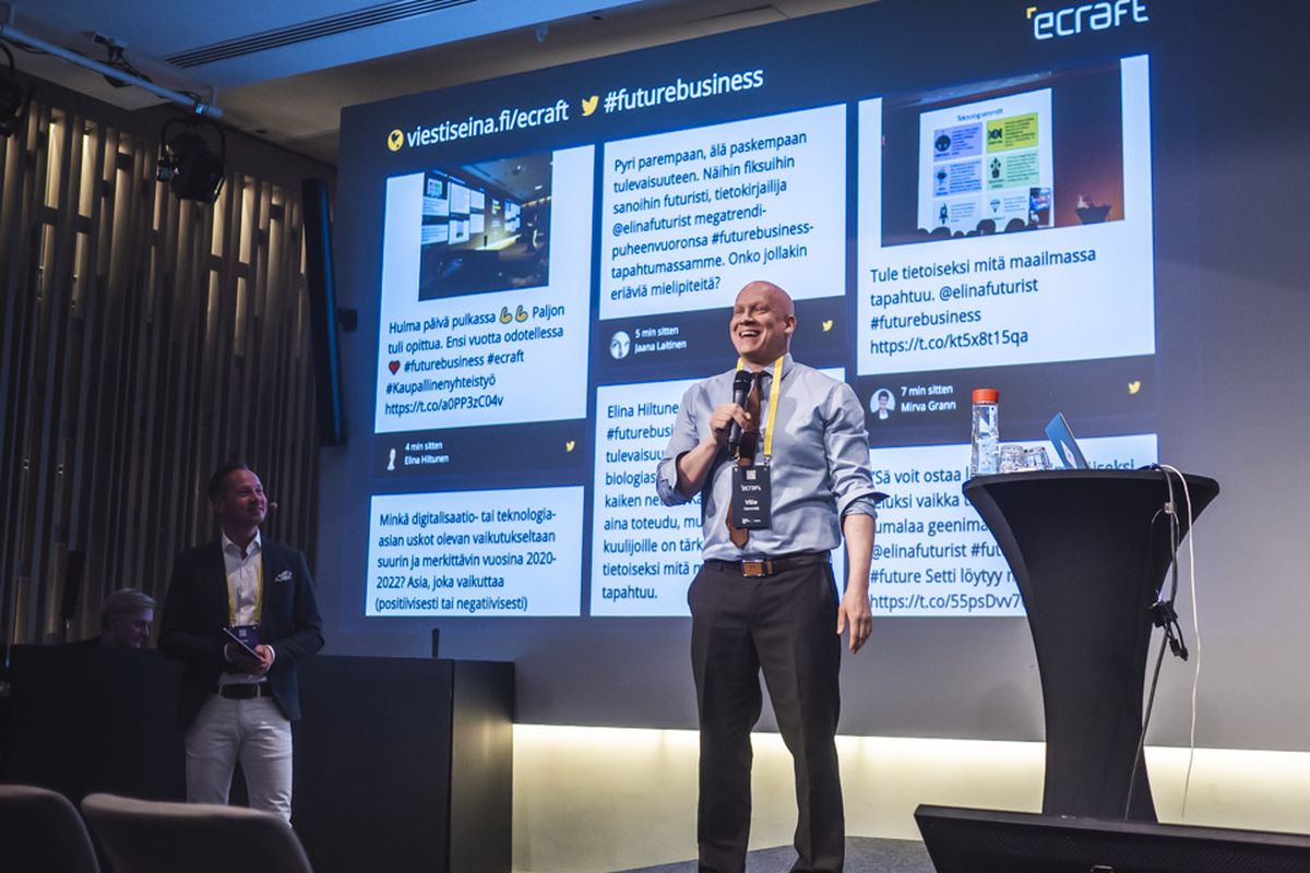
The system rolled out everywhere at once, from recruitment ads to the stage at eCraft's own Future Business Day, so the rebrand felt finished from day one instead of a slow bleed of old and new.